Color speaks before you do. Step into any home, and the walls start the conversation. Living room colors greet every visitor, bounce natural light around, and announce the mood you love most. With one fresh coat, the entire room can pivot from dull to expressive, broadcasting your personal style without a single extra accessory.
Want calm mornings, lively game nights, or a quiet reading corner? Thoughtful hues let you create each scene while keeping the vibe naturally bright and full of new life.
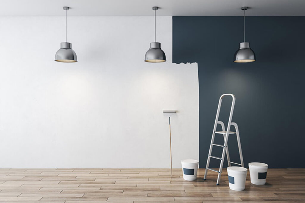
Yet endless paint charts can overwhelm. You flip through fan decks, and every shade claims to be “perfect.” By focusing on what feels right, you turn color choice into a fun treasure hunt rather than a stressful chore. That approach also keeps spending in check, since you won’t chase trends that clash with who you are.
Ready to see how?
Why Your Personality Should Lead the Way for Living Room Colors
Designers agree: people, not palettes, come first. If a hue stirs joy or prompts calm, that reaction matters more than any magazine spread. Start by noting favorite clothes, vacation photos, or ceramic mugs. These everyday items reveal hidden patterns; maybe you lean toward earth tones or bright pops. Matching those cues builds an inviting space you’ll love long term.
Surface finish supports that story. Flat paint finishes cut glare and provide a cozy backdrop for art or books, shifting the overall mood without extra cost. A soft neutral anchor prevents chaos when collections grow. Meanwhile, repeating one tone across borders keeps every hue connected. Sunlight exposure changes color from dawn to dusk, so test a wide range of samples to hold balance.
Five Color Psychology Facts to Guide You
Consider the professional painting tips below as a mini cheat sheet. Each principle is quick to remember and pays off for years.
- Calm shades slow heart rates. Pastel colors will lower stress faster than an espresso machine.
- Vibrant accents lift energy. Use them sparingly on decor if you tire of color easily.
- Repeating undertones unites zones. A single family hue helps open layouts read as one.
- Cool bases lengthen summer nights. Blues and greens look breezy when temperatures rise.
- Warm tints hug in winter. Rich creams and rusts reflect lamplight, making evenings feel safe.
Living Room Paint Colors for an Inviting Space
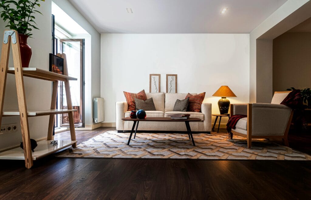
Selecting living room paint colors is like setting out appetizers before a party—you want guests hungry for more. Color controls comfort long before they touch the couch. Lean shades too cold, and conversation stalls; drift too hot, and focus fades.
Consider tactile touches first. Plush furniture in fabrics that echo wall tints stretches the perceived space without knocking down a single stud. When cushions share undertones with key furniture frames, the area feels naturally warm and cohesive.
Lamp placement then guides light onto jumbo color chips, revealing undertones that tiny squares hide. A hint of off white keeps cozy family rooms from feeling cramped, while matching trim ensures lines complement odd corners. Finish it off by framing the fireplace with a richer value of the same shade, and your lounge welcomes every season.

Living Room Paint Ideas & the Best Living Room Colors
You crave a **home paint color** that last longer than social-media trends. The best living room colors stay friendly with changing furniture, holiday décor, and kids’ art. Before the brush dips, read through these bold yet lasting ideas.
Paint often begins with emotion;
- Blue calms busy work minds and lets walnut tables shine
- Leafy green echoes houseplants and links them to garden views
- A splash of orange perks up breakfast but stays polite when paired with white linen
- For movie lovers, deep navy wraps the TV wall, creating instant theater vibes
- A contrasting shade on built-ins keeps storage from feeling like a dark cave
- Designers also rely on smoky gray to bridge metals and fabrics, while buttery beige brings summertime sand indoors.
Durability counts, too:
- High-traffic lounges face sticky fingerprints and pet nose smudges, so choose enamels that shrug off stains
- Want fun tech? Magnetic paint turns one panel into a gallery without nails
- A charcoal edge line adds dramatic flair but still feels grown-up
Best of all, these hues remain timeless, so you won’t dread a color change during your next project two years from now.
Five Tried-and-True Living Room Color Picks
Before diving into swatches, skim this condensed list. Each choice below has earned fan status for staying power and personality.
- Soft sky blue for calm talks and deeper sleep
- Botanical green that folds garden foliage into one indoor view
- Terracotta orange that energizes coffee chats without overpowering artwork
- Classic navy for late-night films and cozy winter vibes
- Feather-light gray to marry chrome legs with wool throws
- Warm beige that flatters wicker, jute, and casual beach art
Finding the Perfect Color Match for Your Living Room Personality
Everyone chases a “wow” factor, yet the formula shifts by individual. Think less about what influencers pick and more about what your heart says while you sip tea on Sunday mornings.
The Glam Enthusiast
Love sparkle? Layer a luxurious touch with pearl undertones across two walls. The surface looks softly painted but beams when sunlight hits. Pair the finish with crystal lamps for instant hotel feelings. Guests will ask about the secret every time.
The Vintage Soul
Old trunks and rotary phones deserve a rosy backdrop. Add one bold floral accent chair, and suddenly your house feels curated, not cluttered. Picture rails close to the ceilings increase perceived height while adding visual warmth. Place crocheted throws for subtle, colorful charm.
The Airy Dreamer
Craving cloud-like peace? Pastel aqua meets that gentle personality. Sheer curtains pair with rattan, keeping an open vision that invites deep breaths. Neutral baskets ground delicate colors, and one honey pine table feels inspired by seaside cafés.
The Story Collector
Tickets, maps, and souvenirs yell for order. Clay taupe calms the eye and leaves shelf trinkets to shine. Wood frames rise against the wall, creating gallery magic without harsh contrasts. This subtle hue also hides scuffs, making upkeep easy.
The Free Spirit
Travel photos spark wanderlust? Sunset coral captures that thrill. Slight gold flecks glint like beach sand at dusk; a detail friends will notice. Lean art canvases on the floor if you prefer casual display, and the bold tone will keep energy in playful play.
FAQs – Living Room Paint Colors
Color questions pop up right after the first sample dries. Below are the most common, answered with clear, honest advice.
How can decor feel fresh without a full redo?
Swap pillow covers, lampshades, and small plants between seasons. These quick changes refresh a setting while the primary palette remains stable for your family movie nights. You skip messy drop cloths, yet the space still feels renewed every three months.
Do warm palettes help me rest after work?
Yes, earthy pigments lower tension by mimicking dusk. A muted clay or soft caramel signals downtime, which is a healthy sign for body and mind. Pair them with layered lamps, and even busy weekdays finish on a calm note.
Are pale tones still stylish next year?
Light backdrops act as a canvas for evolving collections. Whether you favor modern prints or traditional quilts, bright surfaces highlight your best pieces. Tall doors look grander, and daylight stretches farther when walls reflect instead of absorb.
Can paint echo nature in an open plan?
Pick colors found outdoors like sage, sand, or river stone. These shades link patio dinners to sofa chats, uniting separate zones of the house. Keep leftover cans; you might need touch-ups during a garden-inspired project later.
Are colorful cabinetry doors too bold?
Rich teal cupboards turn meal prep into an art show. Friends snap photos, yet the tone won’t date fast when paired with white tile. Because base counters stay neutral, everyone can relax in a sleek and balanced kitchen lounge.
How do I welcome guests without clutter?
Choose mid-value greens for a spa vibe at the center of the house. Display only items that spark joy, and hide the rest in woven bins. A subtle sheen offers easy wipe-downs, meaning less rush cleaning before visitors arrive.
Ready to Add Color Magic to Your Ohio Home?
True personality begins with paint, and True North Painting makes the journey painless. Working across Mentor and nearby areas, the team turns swatches into results that last. Skilled crews manage prep, cleanup, and even furniture moves, so you watch the transformation stress-free. Reach out today—dial 440-665-6347 or email [email protected]—and let expert hands bring your color dreams to life.